Exploring the TickTick App with Lisi Hocke
TESTING TOUR STOP # 1 ▪ HIRZA PIMENTEL ▪ 01/26/2020
First stop on my testing tour was with Lisi Hocke. She did her own testing tour in 2018 and encouraged me to start my own. As I was new to pair testing, Lisi gave suggestions on how we can structure the session. Establishing how we would spend our time at the beginning was very helpful --- having a better understanding of what to expect made me less nervous about my first tour stop. We had three parts to the session: (1) quick introduction on strong-style pairing (2) exploratory pairing on the TickTick app (3) short retro.
Quick Intro
For this session, we focused on exploratory testing. I’m in the middle of reading Explore It! by Elisabeth Hendrickson so I was very excited to be able to apply what I’ve been reading. Lisi suggested that we use strong style pairing. From my understanding, this style is preferred because both the driver and the navigator are more actively involved during the pairing session. You can read more about this from an article by Maaret Pyhäjärvi. To facilitate our pairing session, Lisi had the MobTime timer on her machine, which she set up so we can switch roles every four minutes. She shared control of her machine through Zoom; which made switching roles easier and collaboration more seamless.
Exploring the Application
Lisi suggested three different applications; and we decided on exploring a list app called TickTick. Neither of us have used this before and we had to create an account to be able to download the application. Creating the account was easy. We just had to provide a username, email and password and we were good to go.
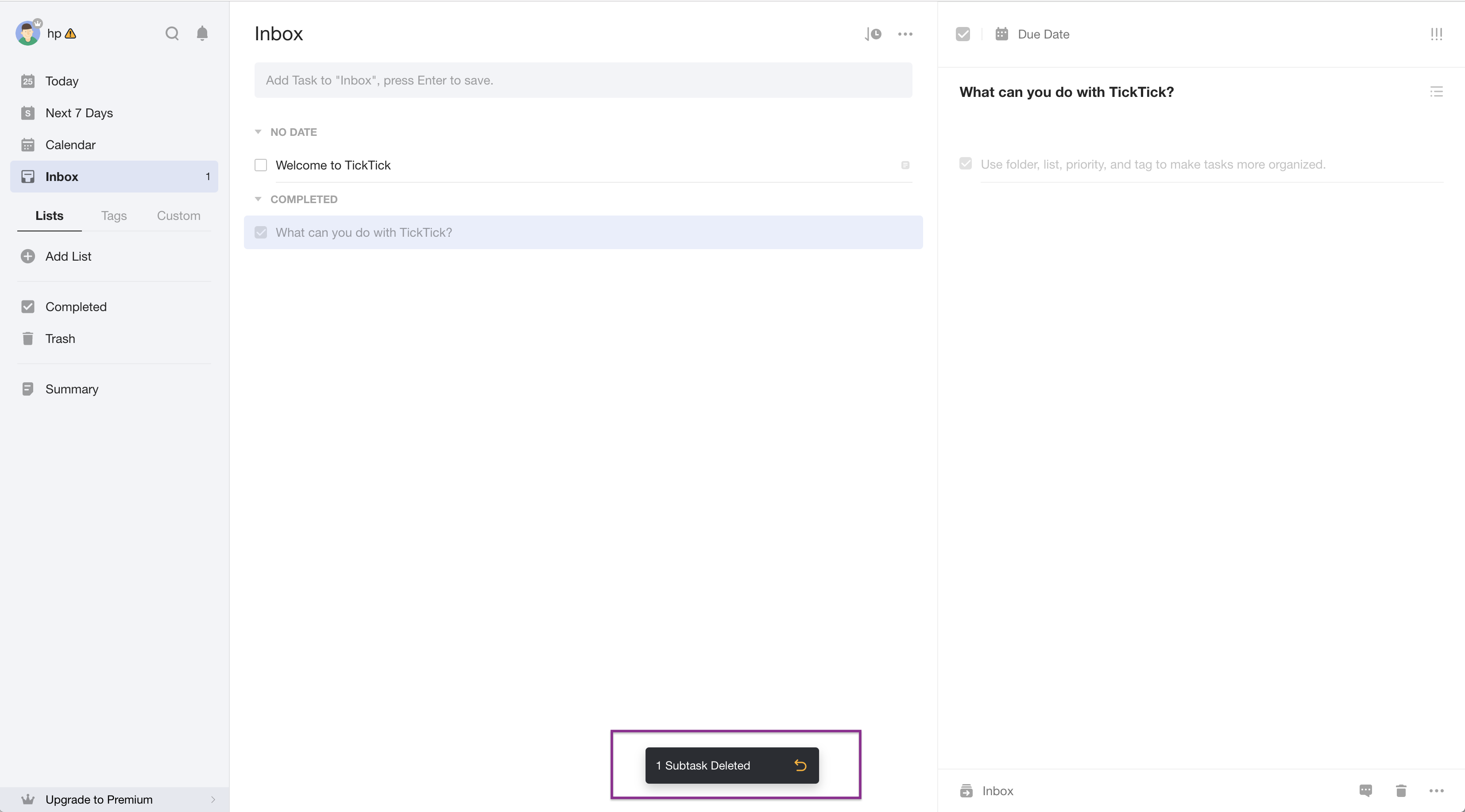
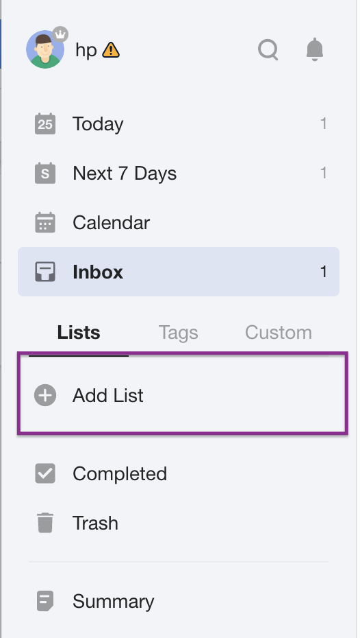
Here’s a screenshot of what we got once we were able to access the app.
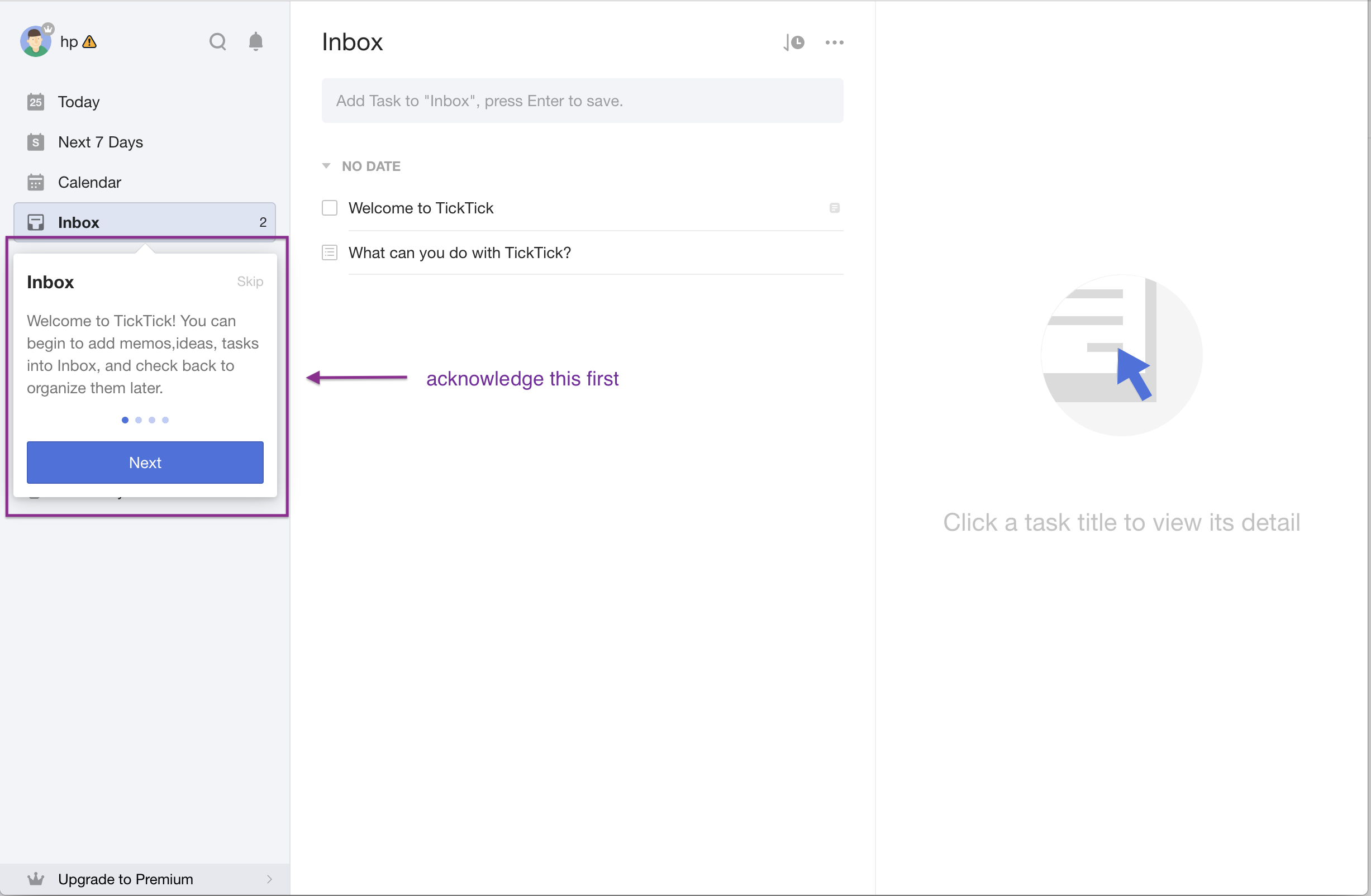
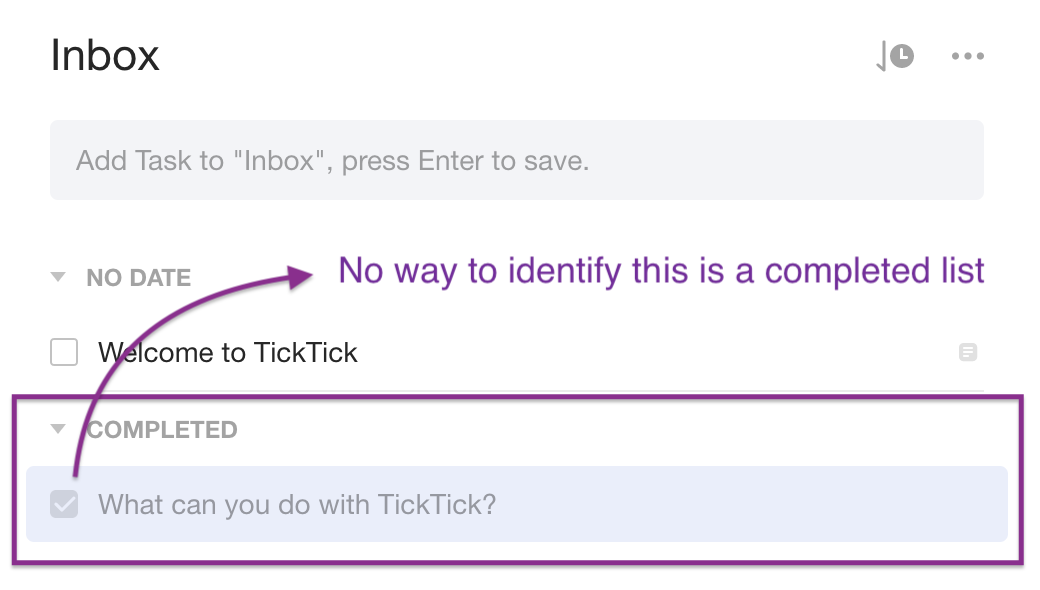
We missed the Welcome message initially, and tried clicking on the items in the Inbox section and it wasn’t doing anything. After clicking Skip on the message, we were able to interact with the application. There were two sample messages in the inbox section (as seen above). One had a checkbox and the other had an icon that looks like a list. Clicking on the checkbox moved the first example in a section called completed. Similarly, clicking on the list icon, moved the second example in the completed section. As expected, clicking on both items that were in the completed section moved them back to the No Date section. Note though that in the Completed section, we couldn't easily identify tasks versus lists.
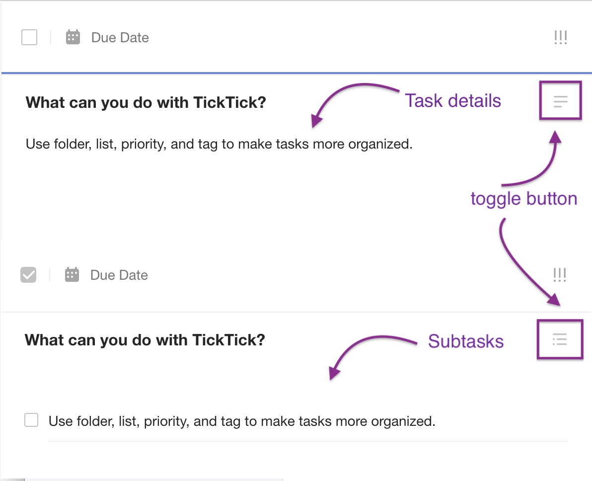
Next we wanted to view the details of the tasks and/or lists by clicking on the actual text. Clicking on the first item (the one that had a checkbox), showed additional details on the right pane. And clicking on the second, showed a list of subtasks. This gave us an idea of a workflow to check. Would completing the list, complete the subtasks?
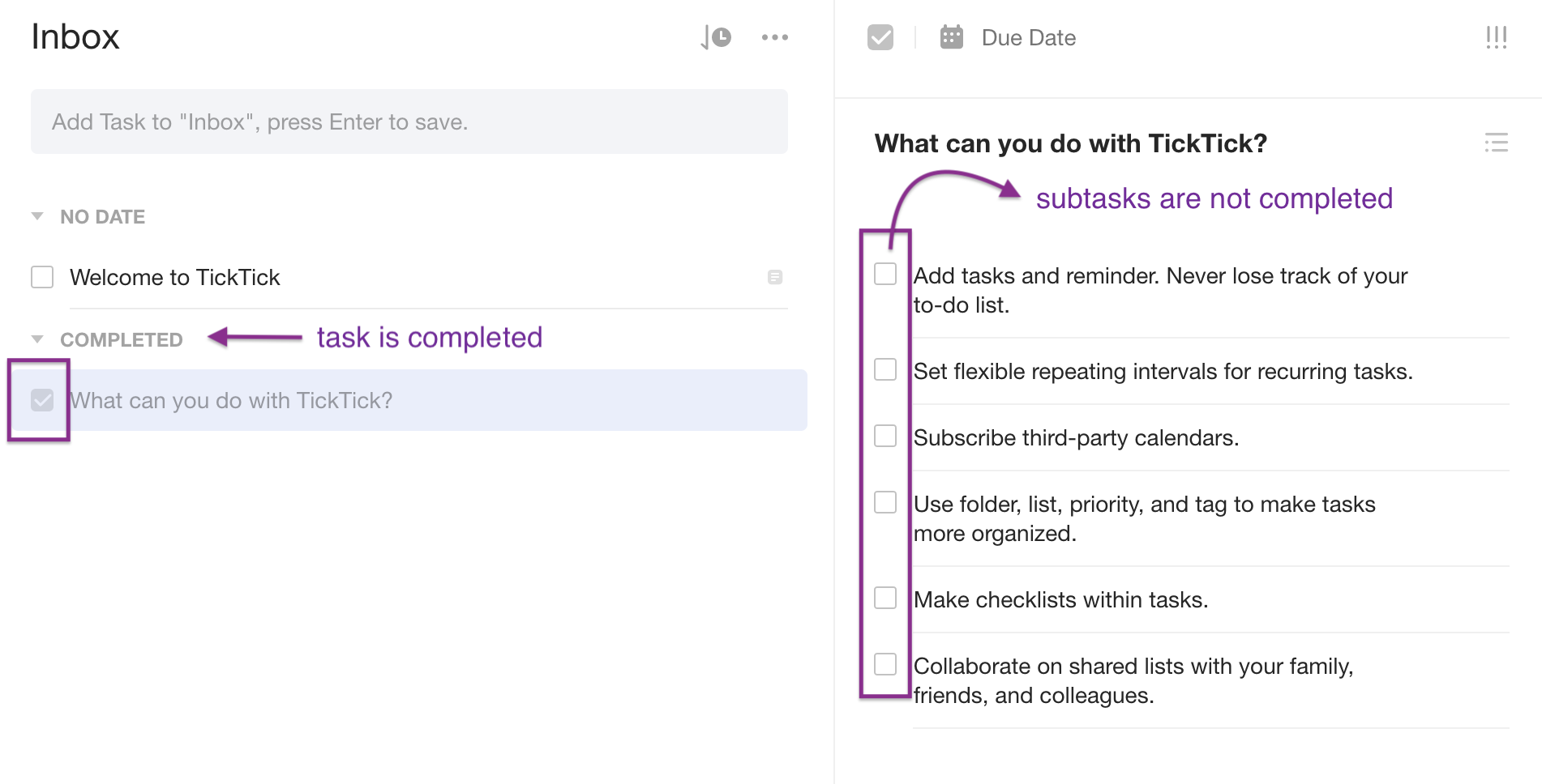
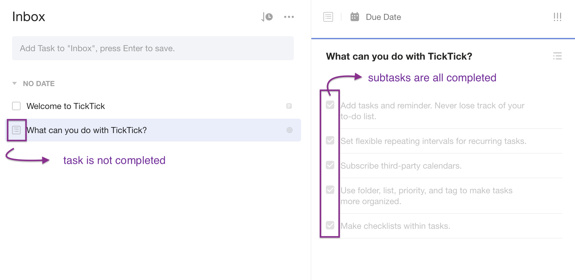
As can be seen on the image above, it did not. The checkboxes remained unchecked for the subtasks even if the list has been completed. The inverse worked though; checking each subtask marked the list as complete. Another outcome that didn’t work as expected can be seen in the screenshot below. You can see that all the subtasks were completed but the main task was not marked as completed. This was after we deleted a subtask, which was currently unchecked.
In the last workflow, when we deleted the item, Lisi noticed that there was a message giving the user the option to undo the last action.
The message disappears in a couple of seconds (even when the user’s mouse was right over it) and we raised the question of whether the user was given enough time to react to it. It seemed that it would have been easier if either (1) the message was displayed close to where the delete icon was or (2) if the user was asked to confirm they wanted to delete the task instead of allowing them to undo the delete action.
There were two other icons related to the subtasks on the rightmost pane. One of which looked also liked a list. It was a toggle button that allowed user to change the paragraphs to a list and vice versa.
The other icon looked like an alarm clock, but when we clicked on it, it just displayed a message asking if we wanted to upgrade to premium. Since we were just checking the delete and set time functionalities for subtasks, we decided to check the same functionalities on the main task. Deleting tasks in the Inbox works the same way as deleting subtasks on the right pane. However, we noticed that instead of seeing individual icons when the mouse was hovered over the item (like on the subtask); we got a menu icon. This menu showed us a number of options (setting a reminder, setting the priority, etc) but we noted the inconsistency between the two related sections.
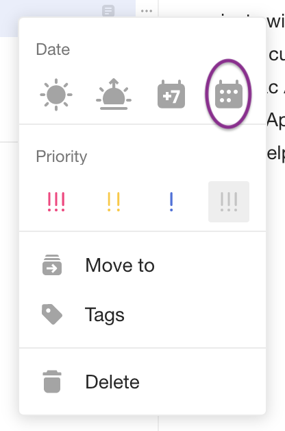
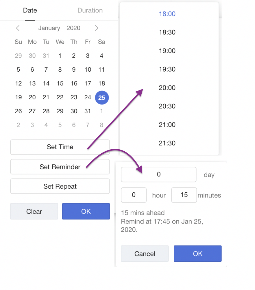
Clicking on the calendar icon (custom date) on the menu gave us the options to set time, set a reminder, and set repeat. On this dialog, we've obsered that:
- We’re allowed to set the Due date to a date that has already passed
- When we clicked on Set Time, the default time was selected based on the current time; but we are only given options in 30 minute increments.
- We are able to set a combination of day, hour and minute for the Reminder using the custom option.
- When we had Set Reminder set and we removed the value under Set Time, the reminder gets deleted as well.
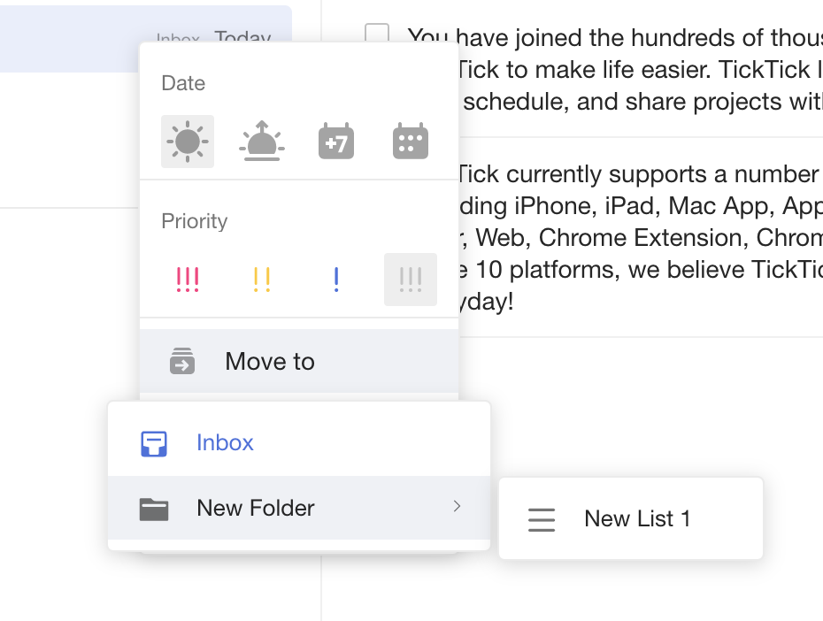
It seemed like giving users different ways for setting the time and the reminder made it less cohesive. We tried to check the Duration tab as well but it was not accessible unless we upgrade to premium. And so, we went back to the menu and hovered over the Move To option, it only gave us one option, which was the Inbox. We raised the question of why Inbox was displayed given that our list is already in the Inbox. We looked at the page to check what we can do to add more options there. We tried creating a new label but it didn’t show up in the Move To list. And so, we tried creating a list.
We created a folder to add the list to; and both the new folder and new list showed up in the Move To option. And we were able to move both lists and tasks to New List 1. We noticed that tasks and lists can only be moved into lists and not into folders.
After that we checked setting the priority and sorting tasks in the Inbox. Options for sorting included Custom, by Time, by Title, by Tag and by Priority; but all of these only sorted in ascending order. Also, when we had sorting set to the Custom option, we were able to drag and drop items on the list and the order was saved when we switched from sorting by title; then back to Custom. When we were dragging the items, we had to make sure that we’re dragging inside the purple rectangle below for it to work. This was unexpected since the icon for dragging is displayed to the left of the checkbox

There was also another menu next to the sorting icon, and that one includes hiding the Completed section, listing Activities (only available in Premium version) or Printing the list.
Retro
After pairing for a little under an hour, we realized that we ran out of time. I was initially nervous about this session but once we started exploring TickTick, time went by quickly. Lisi pointed out that we didn’t even get to test the application for accessibility. Also, I had planned to take notes, but I was focused on our tasks that I ended up forgetting to do so. I tried to include everything I could remember from our session (hopefully I didn’t miss anything). Lisi suggested that having a shared note might help in the future.
Overall, it was a fun first testing tour stop for me. And I am extremely grateful to Lisi for taking the time to share this experience with me. Looking forward to my next testing tour stop; and I’m hoping to have more pairing sessions in the future. Please feel free to reach out here or on Twitter if you would want to pair on anything testing related.